Engineer’s Workshop: Enhancing Character Customization
Now that we’re less than a week away from the release of Shadowlands, we hope you’ve had a chance to play around on the pre-patch and glow up your characters with the new character customization options! While you were fiddling with new hair styles and eye colors, you may have wondered what it takes to overhaul a major system that has been progressively expanded upon with every expansion; so stay a while, and read about how we helped bring these new options to life!
A Little History
When World of Warcraft originally shipped, it was our utmost priority to make the game playable for as many people as possible. To do this, the minimum specifications had to be optimized so a wide variety of hardware could run the game. As such, compromises had to be made. Should individual fingers be added to characters’ hands when it could impact frame rates, or should that processing power be directed at a gameplay feature instead? Since our launch in 2004, those concerns have faded due to performance increases in each generation’s hardware, offering us a chance to explore new ideas and upgrades.
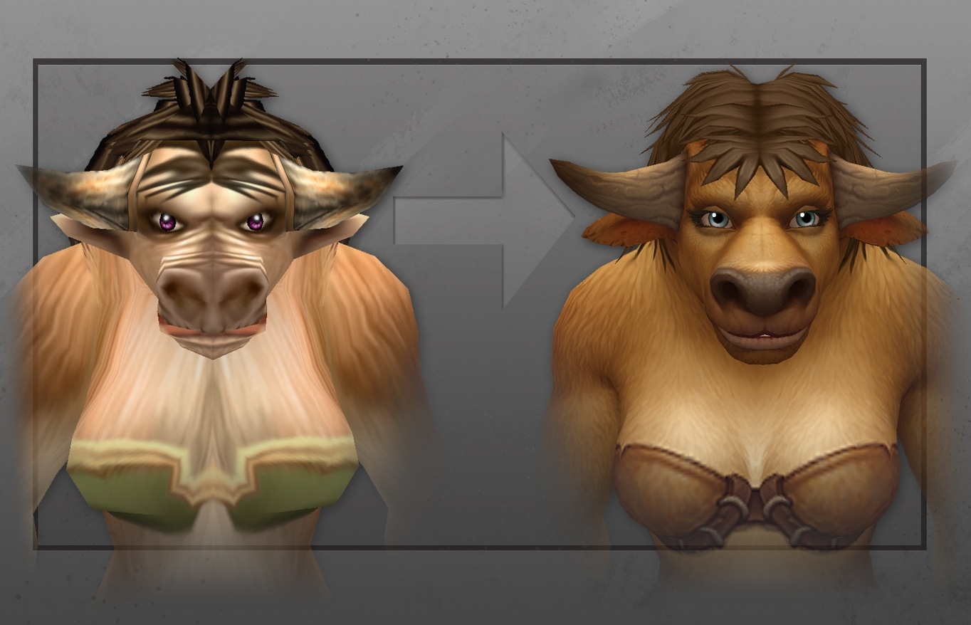
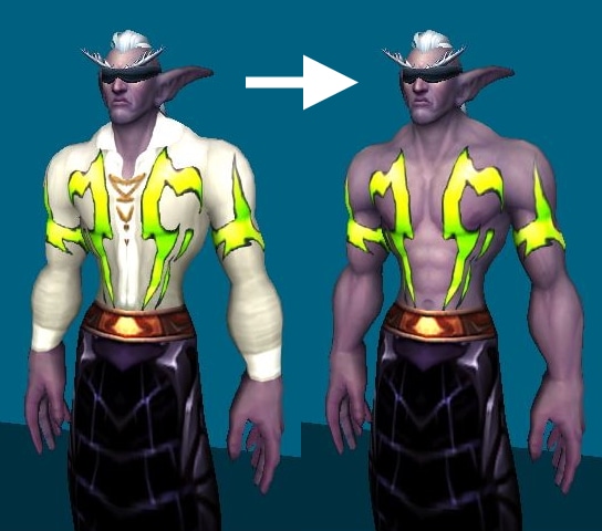
So, what did we change and how were the early characters built? Originally, the data model was relatively straightforward, but as time went on—and new features were added—the strain started to show. Per race and gender, only five features could be customized (later expanded to eight in Legion), but what does one do when you've already used all five? How would someone create Demon Hunter NPCs prior to Legion, when Night Elves already used all five slots? Designers clearly had a flash of inspiration when they used the item system to effectively add another feature; since shirts come first in the "paste hierarchy," they could make it appear like there were tattoos by adding alpha and transparency to the whole shirt, minus the tattoo parts. Clever!
Systems, Gameplay and Data Layout
The technical gymnastics discussed above are not what we want to go through every time a developer wants to create something special. So, we gathered such lessons from expansions past, and knew that we ultimately wanted an unbounded amount of customizations, where each feature would be separated from the rest (such as eyes, face, beard or moustache), rather than locked to five generic slots. We wanted it to be easier to maintain, and we didn't want to duplicate large swathes of data (see our "spreadsheet" style editor below, where every cell is a face variant crossed with a skin color choice). Most of all, we wanted to reduce the overall load on artists creating assets and designers hooking them up.
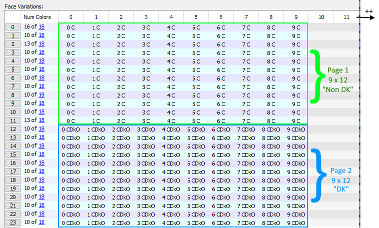
To start off, we took a loose affiliation of database tables, where each record held monumental amounts of information, and split the whole thing into smaller, more logical data groupings. In turn, this allowed us to part ways with the spreadsheet editing and create a series of custom and auto-generated editors that would look very similar to what would be eventually shown to the player in game. In the end, the new data layout allowed all the flexibility we need, as well as offered us opportunities for cool new customizations that weren’t possible before, such as allowing Worgen and Gilnean forms to be changed independently.
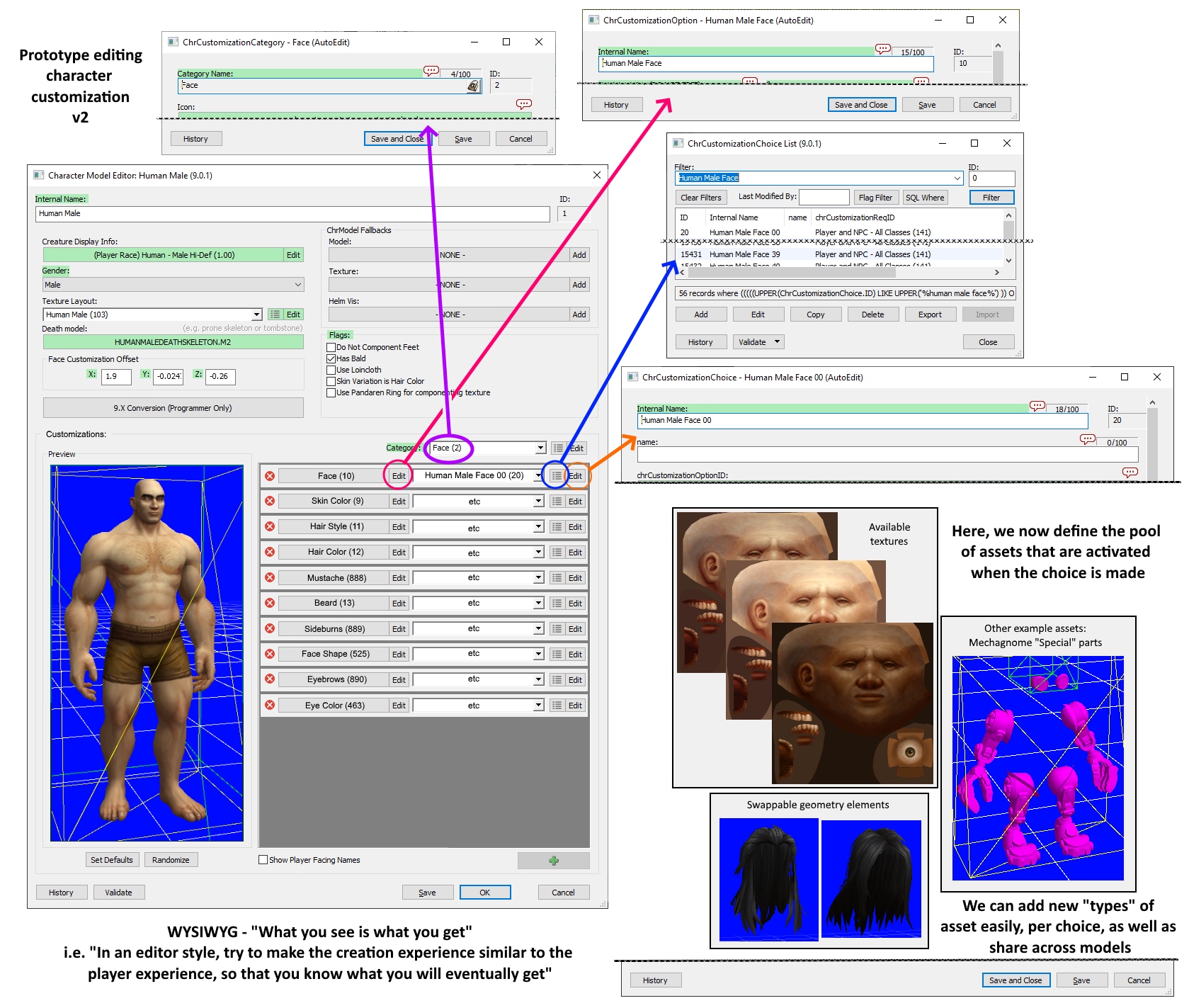
Finally, as we had totally overhauled the data and gameplay elements, we also needed to be prepared for all of the players logging in on day one with the old data, and make their characters look the same as they did before pre-patch (not to mention tens of thousands of NPCs). We created a silent conversion process with almost 9,000 rules to take care of this, which takes into account things like the Human beard option now being split into beard, mustache, and sideburns. The automation team built a tool that could compare before and after screenshots en masse, for QA to quickly identify any mismatches. If all went well, our players could log in on pre-patch day and hopefully not notice that anything happened at all to their beloved characters!
Rebuilding the Engine
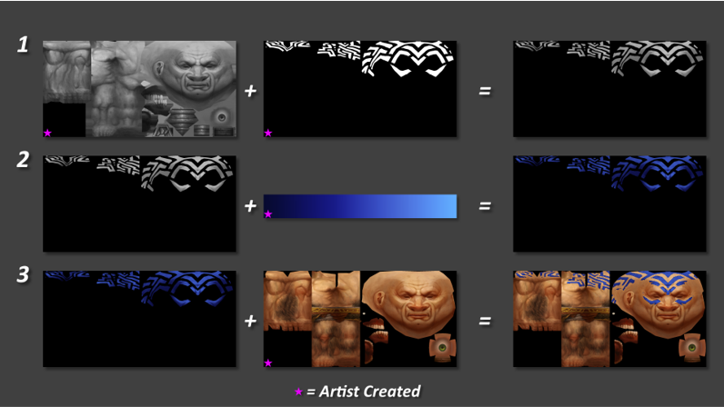
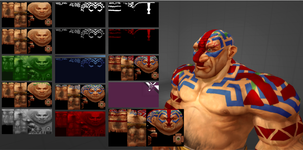
To facilitate the new customization options, a complete overhaul of the engine was required. In the past, each unique set of customization options required its own texture, and choosing different options would change which unique texture was used for a given character. The number of new Shadowlands character options has sent the permutation count into the range of millions, so we wrote a brand-new character system to procedurally generate player textures on the fly.
Among other changes, all texture processing code was rewritten from scratch using SIMD (Single Instruction Multiple Data) extensions and a system built for managing shared resources between characters that use the same textures. These changes maximize processor utilization and helps us avoid performing duplicate texture work for intensive scenes. In tandem with the new database layout, this allowed us to create a lightning-fast, 100 percent data-driven system, moving away from manually set up database tables. Here’s an image of what happens in the engine when it receives a request to build an dwarf.
User Interface and Animations
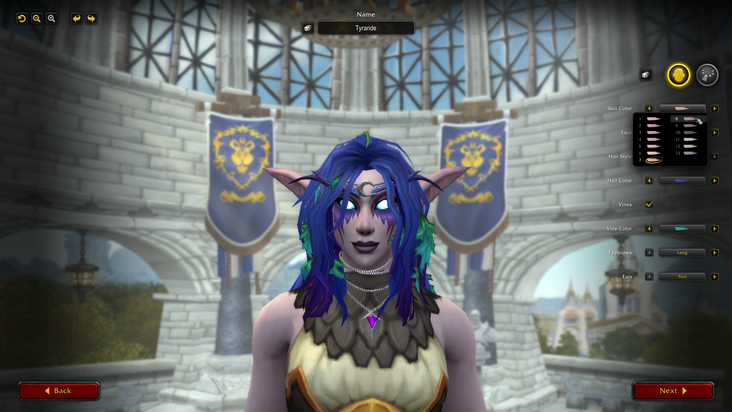
With the increased number of customization options, the user interface had to be completely rewritten from scratch for Shadowlands. The new system allows designers to create and categorize as many customization options as they want, without any need for reengineering the underlying code or systems to support it. Each option can also have as many choices as we want, and designers can choose to display each choice using a custom name, up to two color swatches or with just a number. A lot of work also went into making the whole experience much more responsive to player input, allowing choices to be viewed as the player hovered their mouse over them rather than having to click on each one to view it. The entire customization UI is now also shared between character creation and the Barber Shop.
We also rewrote the entire race and class selection screen, which now allows our outstanding designers and artists to add custom animations and effects. Because we are in the creation screen, the main game systems aren't running yet, so this required an extensive refactor. In the new system, the artists and designers have full control over which animations and effects play for every single race, class, and gender combination, and can make changes as needed.
We hope you enjoyed the glimpse behind-the-scenes of character customization as much as we've been enjoying the creative looks emerging from these changes! Stay stylish, Azeroth!